Creating individual home workouts for active young adults stuck at home during the COVID-19 pandemic
Design Problem: What can we do to keep college students active during quarantine despite non-conducive environments, loss of internal motivation because of quarantine conditions, and lack of equipment?
As a team of 4 budding Human Centered Designers, our group set our goals to create a mobile app that would help previously active young adults stay healthy by providing them a product that would motivate them to continue working out despite the restrictions and isolation of quarantine.

User Research
01 / Stakeholders
College students at UCSD who were consistently active whether through NCAA sports, gyms, or even yoga memberships before shelter in place orders began.
02 / Contextual Inquiry
In Zoom interviews, we were able to get a better understanding of how their level and type of activity has changed. We focused on location, types of workout, equipment, and social interaction during workouts. Through this information, we hoped to gain insight as to what motivated these people to return to the gym so frequently and how the lack of equipment and companionship during workouts affected their overall activity.
03 / Affinity Diagram
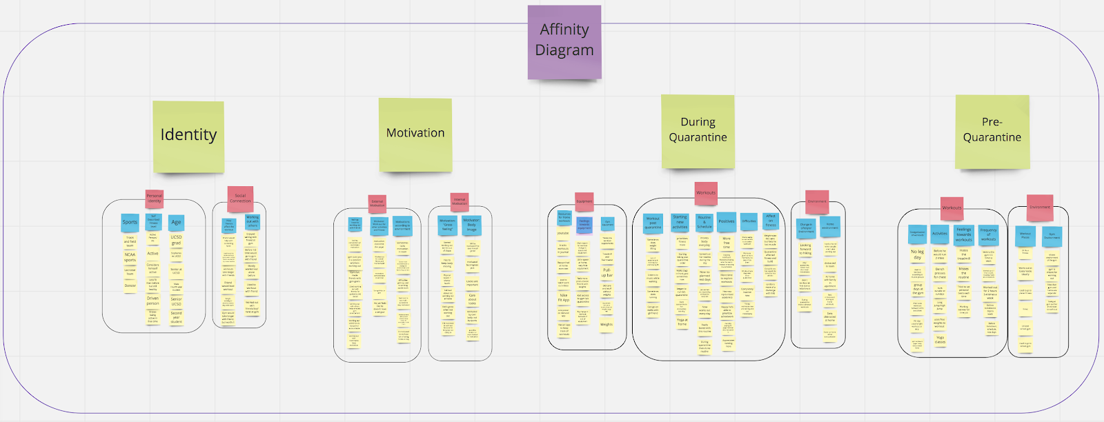
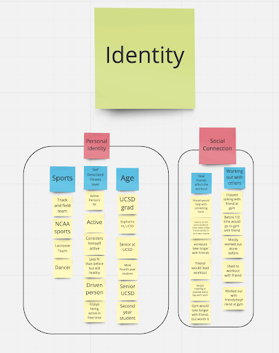
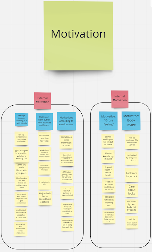
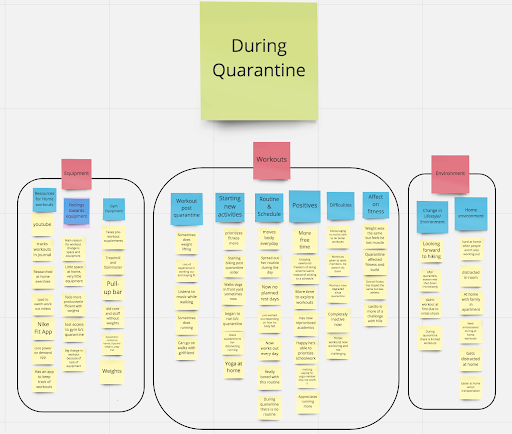
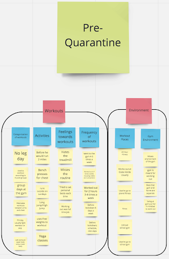
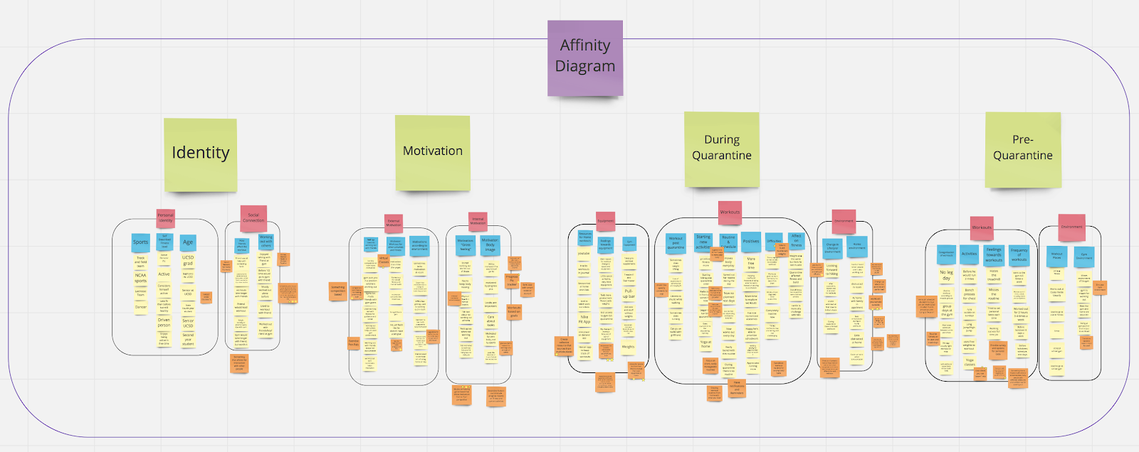
To understand the patterns and trends that may have been present in our Contextual Inquiry, we built an Affinity Diagram. We discovered four main groups when developing our Affinity Diagram: Identity, Motivation, During Quarantine, and Pre-Quarantine.
04 / Design Models
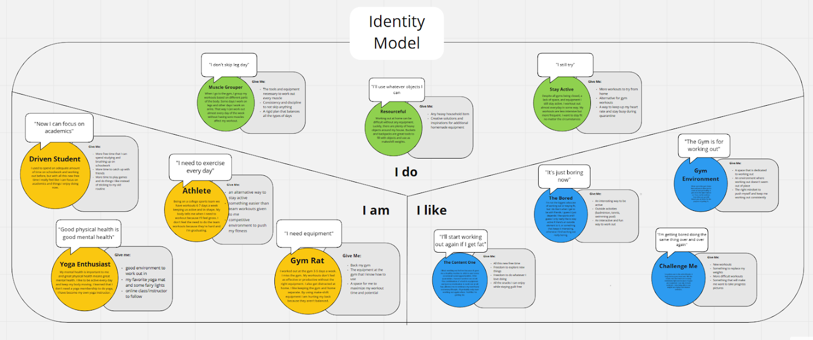
We decided to create an identity model because we found numerous interesting characters that emerged from our interviews. Our interviews revealed how much our stakeholders’ identities played a part in how they were dealing with their new fitness routines that came from being in quarantine.
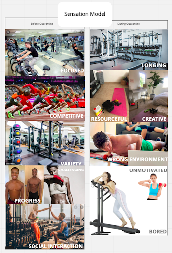
We created a sensation model because we believed how our participants felt about the sudden change in environment and lifestyle was pertinent to understanding how they were adjusting their routines
Let's organize what we have
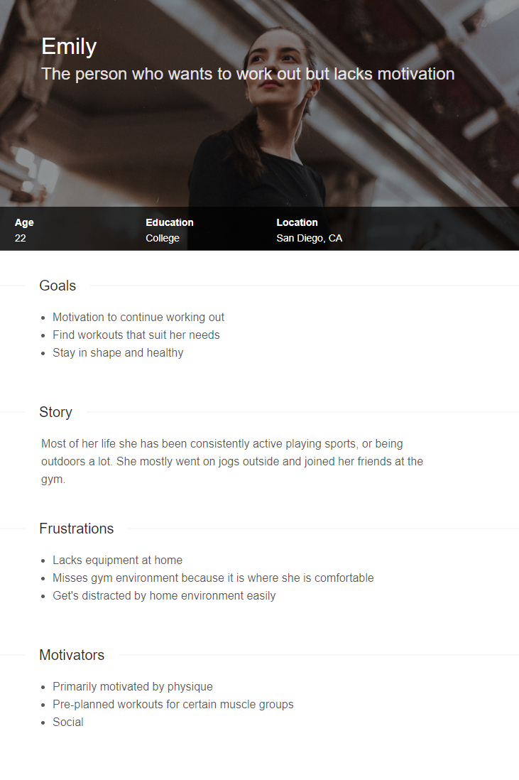
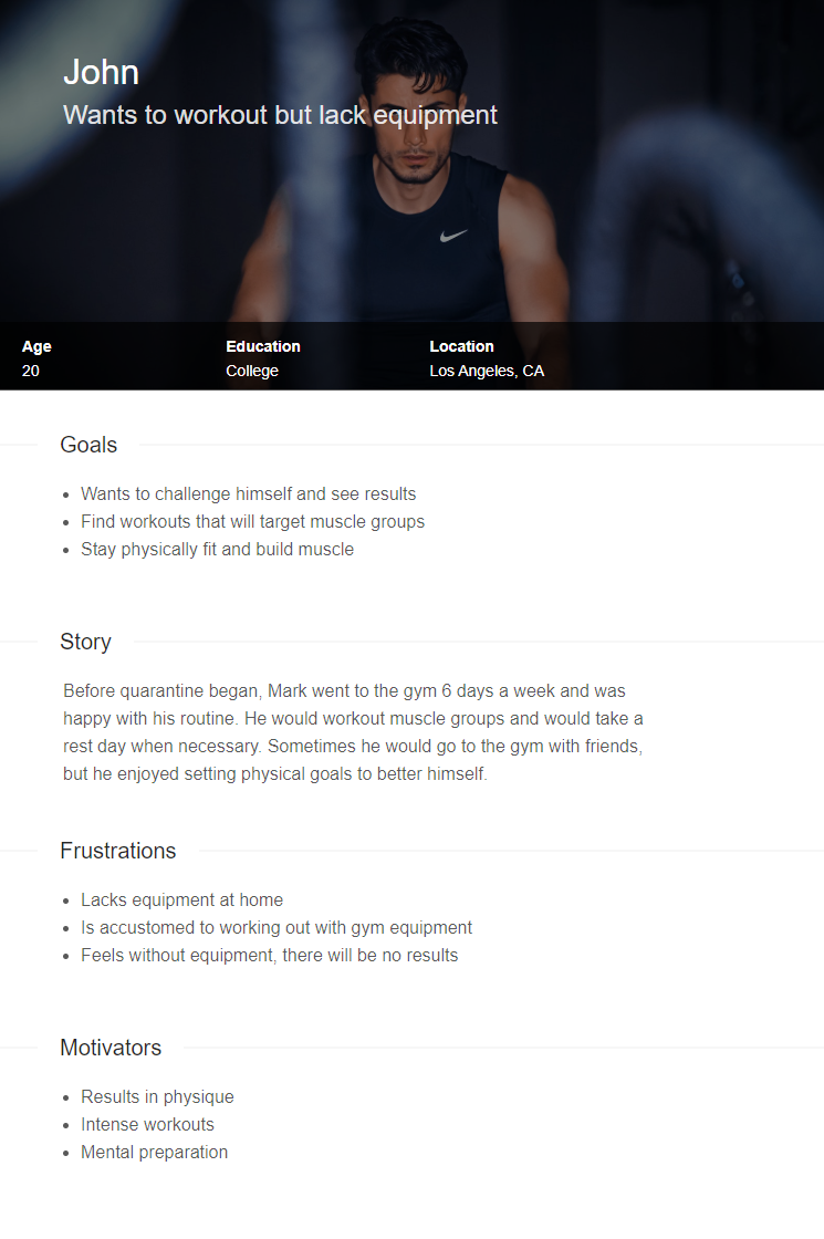
Who will need and want to use this app?
05 / Personas
Design Process
06 / Ideation
Wall Walk: Our team looked through our affinity diagram sticky notes and added orange notes with ideas for designs. We put down all our ideas, even if there were some repeats.
Star Ideas: Each team member chose 5 ideas they liked the most, and we sorted those into "hot ideas"
Visioning Session: We sorted the most popular ideas, then presented a vision where they were actually using the design.
07 / Wireframing
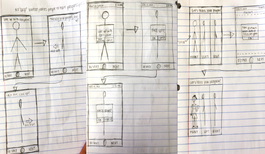
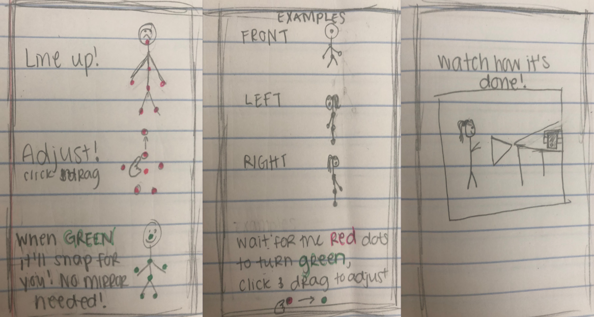
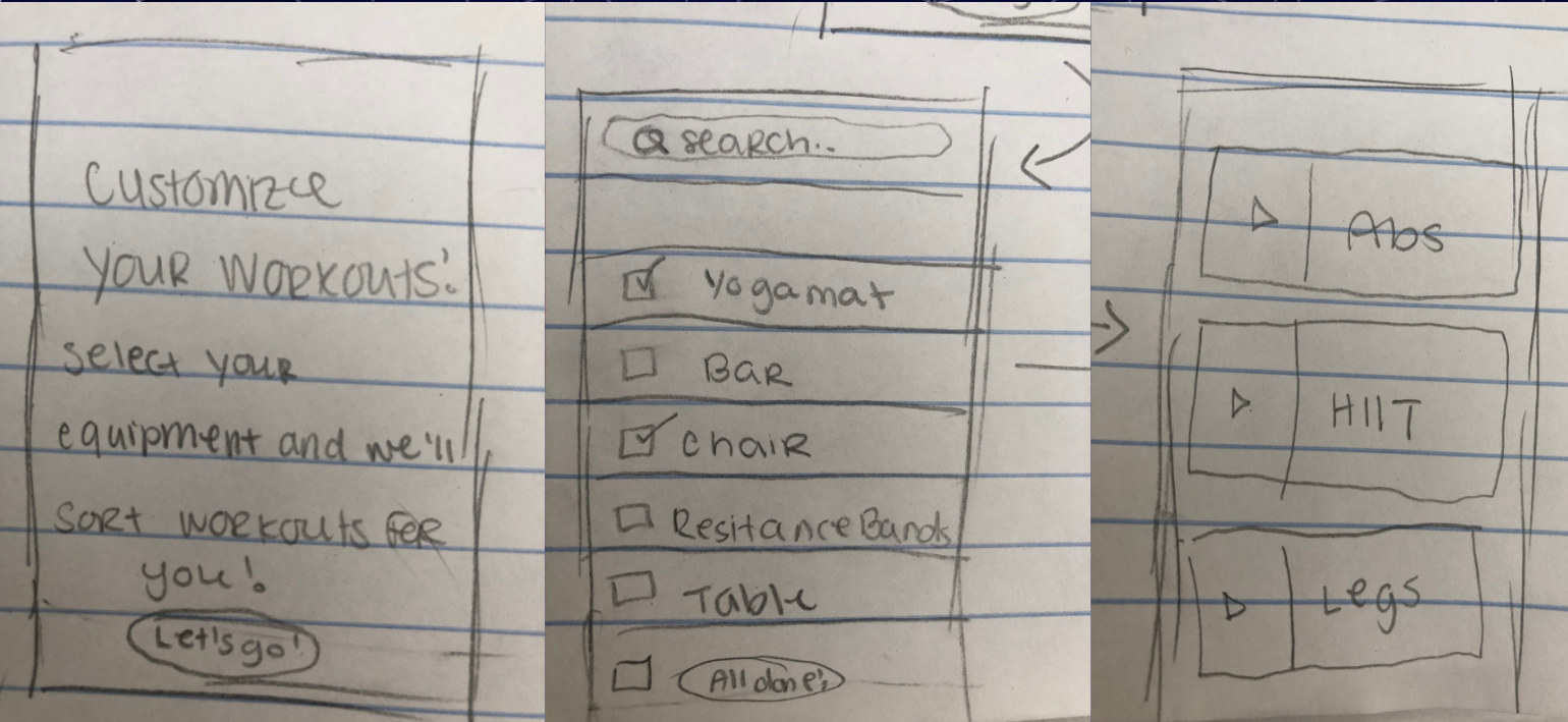
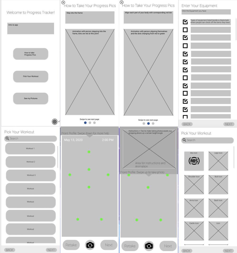
We began with hand-drawn sketches of our most popular ideas, then followed by integrating our favorite features of each into our first low-fidelity wireframe into Figma
Building the Product
08 / Prototyping
Using Figma, we began to create multiple iterations of mid-fidelity prototypes, editing between user interviews and suggestions.
09 / User Interviews
The biggest advantage to having many interviews throughout the design process was leveraging the information provided into updated designs. It was after we transferred our rough designs into Figma that we were able to really use interviews as a tool for improvement.
10 / Validation Testing
We created an interview guide containing an introduction, specific tasks, and feedback questions. During the completion of the tasks and interaction with our highest fidelity prototype, we emphasized "thinking out loud" interaction from the users, as we took notes.
Pure Progress
