Tutator Forward
An in-line translator to simplify the process of translating page content for developers.
Platform
Web-extension
Tools
Figma
Adobe XD
Pen and Paper
Role
UX/UI Designer
Overview
Today, the process of translating an application into one or more languages is a manual, time-consuming process where translators are given text-based files (usually in English) with hundreds, if not thousands, of entries to translate without proper context. Tutator is developing an inline translation tool to allow translators to translate page information from any language to any language directly from the live application screen. This widget is integrated with online automated translation tools (Google Translate, DeepL) to speed up the translation process.
Design Brief
01 / Company Profile
- Fondation Tutator: Swiss non-profit, provide global social services
- Developed a Beneficiary Management Platform to allow quick and efficient development of custom complex web-based applications at a low cost. These web-based applications are for government or non-profit entities that are working with vulnerable populations worldwide.
02 / Goals and Objectives
- Cut down translation process time
- Improve the accuracy of translations in context
- Visible for users to interact with directly on web application
Make the translation of page information as easy as possible
03 / Target Audience
- Employees and Translators
- Adults (25-60)
- Bilingual (Fluent in English)
- Workplace: home/office
- Intermediate to advanced computer proficiency
04 / Design Requirements
- Asset Dimensions: Web Browser/Desktop (1440x1024)
- File Formats: Figma, Google Material Designs
- Color Palette/Branding: N/A
05 / Milestone Breakdown
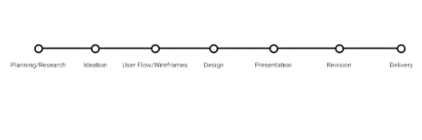
Ideation
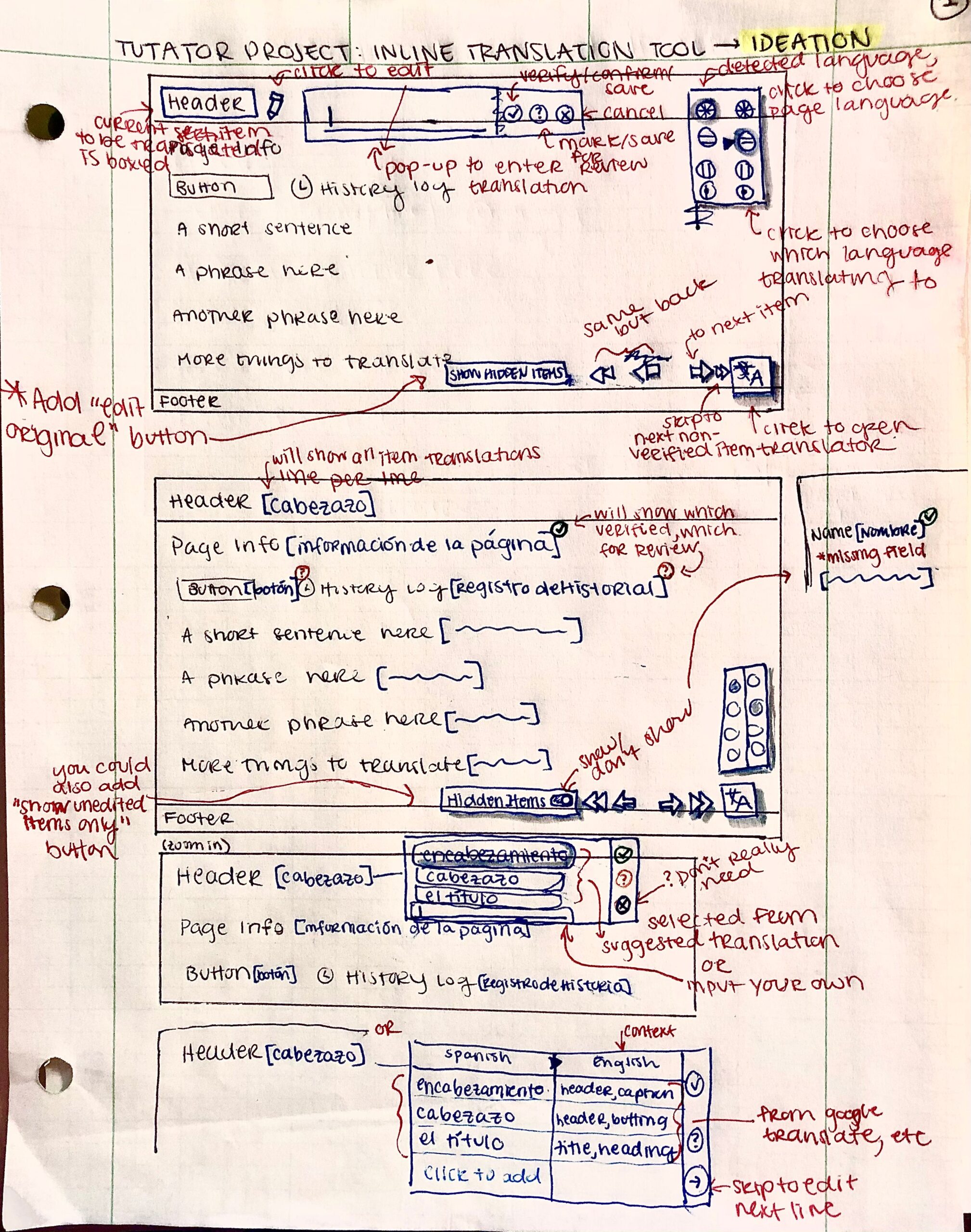
Pen and paper to get the ideas flowing!
This first step was brainstorming, revising, and getting organized before moving the project over to Figma.
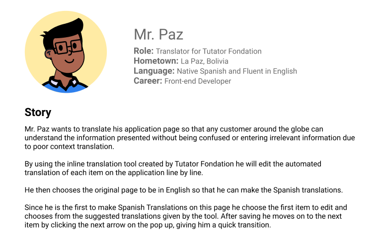
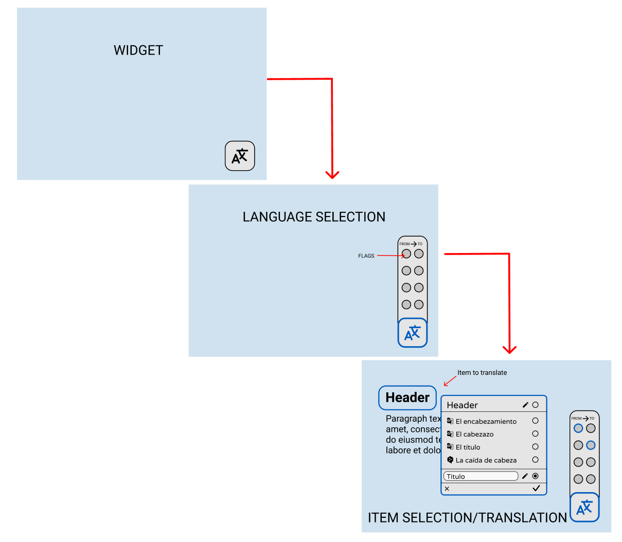
User Flow
01 / User Goal (story)
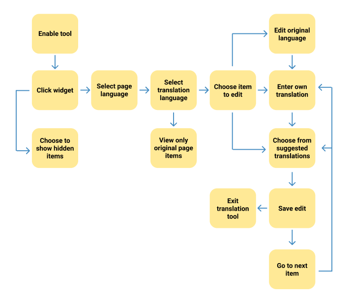
02 / Task Flow (action)
03 / Wire Flow (component)
Prototype Design
After some final deliberation and approval from the Business Manager and Product Designer, I began to design the first round of high-fidelity mock-ups.
01 / First Round - Prototyping
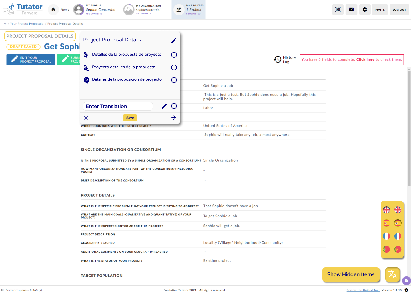
- Higher fidelity version of wireframes
- Ability to edit both original item and/or translation
- "Show Hidden Items" button to reveal pop-up messages that do not originally show up on page for translation
- Flags to visually represent language selection
02 / Second Round - Prototyping
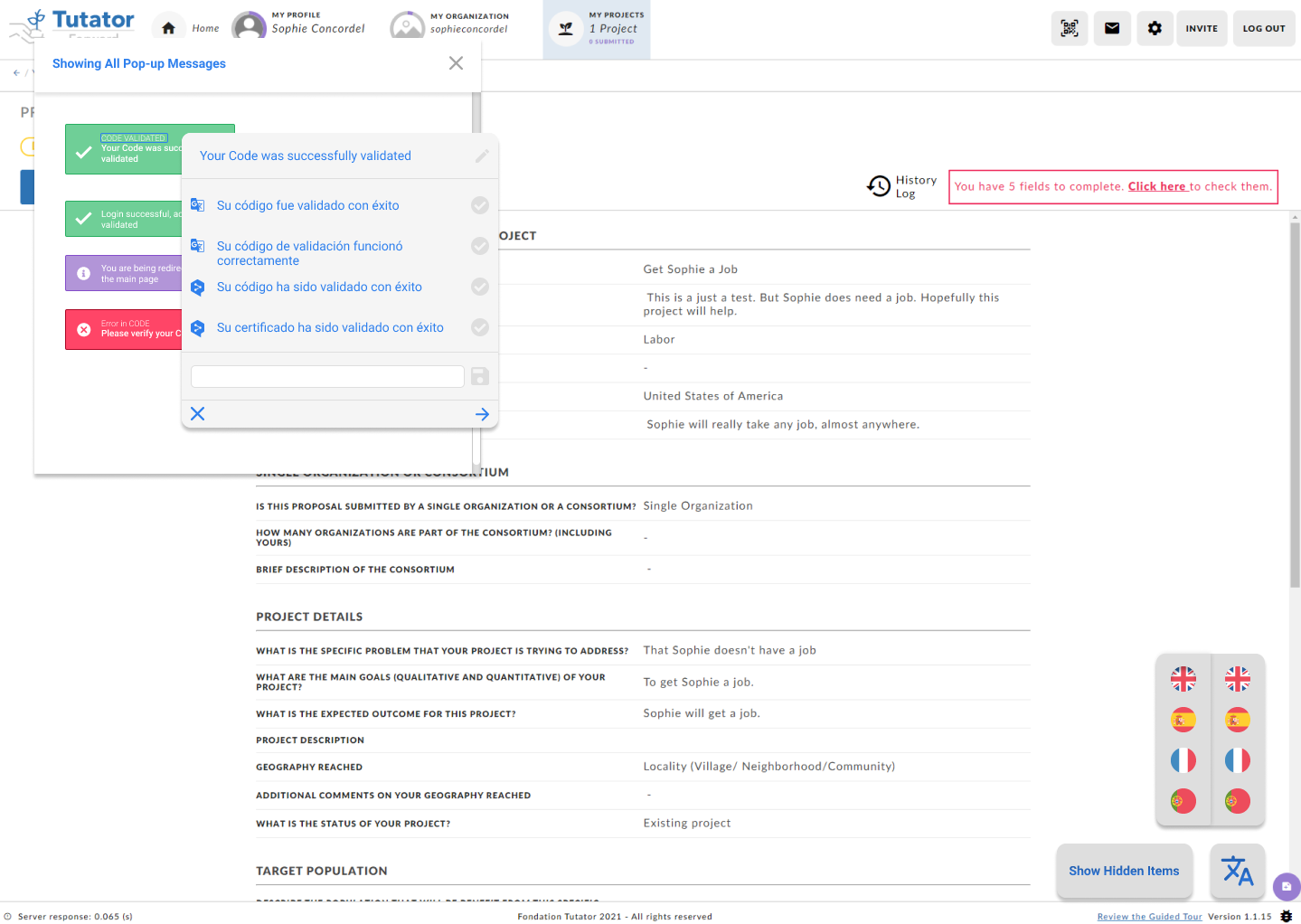
- Color scheme change for a cleaner, less aggressive look
- Smaller text to avoid overcrowding
- Removal of unnecessary buttons such as:
- edit of translation > text box instead
- save directly from text box, instead of saving twice
03 / Third Round - Final Prototype
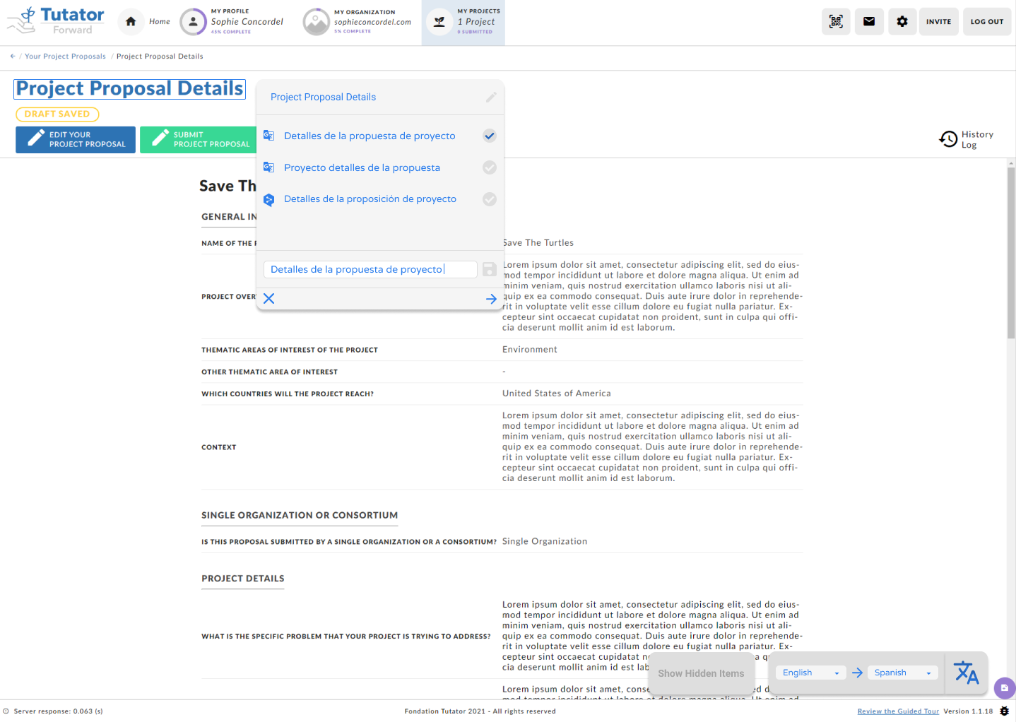
- Overall color scheme, and style remains the same
- Most significant change in language selection, from flags to dropdown menus
- Simpler to "decipher" the same of language than flag which it represents
- The dropdown menu still allows choice, while compacting a much longer list of language options
- The arrow clearly indicates from which language one will be translating from and to
- Attaching the language selection to the original widget is overall more cohesive as a tool
In-line Translator
